
Helping small-business owners finish a lending application — on their own
How a research-led redesign of BMO's self-serve credit application cut drop-off on its worst screen
Who we are
Bank of Montreal (BMO) is a Canadian multinational investment bank and financial services company. Within the Business Banking Express (BBX) team, our priority is to enhance the banking experience for small business customers, specifically in areas like chequing accounts, credit cards, and credit lines.
Intro
Role: Product Designer — sole designer on the application flow Product: BMO Business Banking Express (BBX) — self-serve credit card & credit line application Platform: Responsive web · English & French (Quebec-regulated)
My contribution: Research, problem framing, end-to-end design, rollout across two releases
Headline outcome: Reduced drop-off on the post-submit loading screen around ~8% — one prioritized fix inside a larger funnel redesign


Fig 1 BMO small business credit card landing page
Summary
Small-business owners were abandoning BMO's online credit application at every step. I joined the Business Banking Express team as the sole designer on the flow, inherited an existing, leaky experience, and rebuilt it into something an owner could complete without a banker.
I co-ran segmented user research, prioritized the findings by impact and effort, and shipped a series of fixes across the funnel. The standout: a loading screen that was quietly losing people after they'd finished the application. A small, deliberately-chosen intervention there took drop-off rate around 8%.
The problem
A lending application is one of the hardest things to make self-serve. It carries everything a banker would normally handle in person — eligibility checks, business and personal identity, net-worth disclosure, fraud and identity verification, province-specific regulatory consent, and a real credit decision — and asks a non-expert to get through all of it alone, on the web, without giving up.
BMO's existing flow wasn't doing that well. Owners were dropping off at nearly every step, and the people who started rarely finished. [Insert your before-state completion figure here — state it precisely, e.g. "X% of applicants who started reached the end."] That's expensive drop-off: these are qualified small-business owners who came to apply and left empty-handed.
My role & the team
I was the only designer on the application flow. I didn't start from a blank canvas — I inherited an existing flow and design system and was responsible for enhancing the entire experience end to end.
I worked alongside a UX researcher (I co-ran the interviews, rather than just receiving findings), product management, and an engineering team whose capacity was the main constraint on what could ship and when. Knowing that constraint up front shaped how I prioritized.
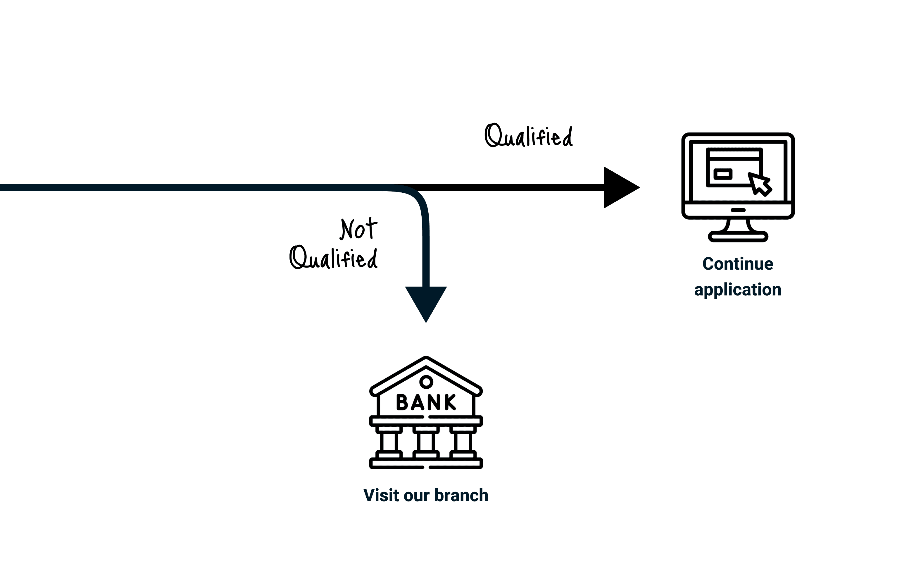
Fig 2 Even user did not drop off, they will filter by the back end system to determined if they can continue or not.
I didn't want to guess at where the flow was failing, so the work started with research and ended with a deliberate sequence of bets.
Segmented research. We ran interviews split by the segments that actually behave differently in this flow — new vs. existing BMO customers, and sole proprietors vs. incorporated businesses — and logged observations screen by screen across the whole journey, so we could see where each segment struggled, not just that they did.
Prioritization, not a wish list. I synthesized the findings by stage and ran everything through an impact/effort matrix. That's what kept this honest: the highest-priority pain points weren't where I'd have guessed. They were the Financial Info and Personal Net Worth steps, where people couldn't parse terms like "Joint Value" and "revolving credit," and some abandoned to phone their branch rather than risk getting it wrong.

Fig 6 A fully interactive tip box, allowing users to explore the information further.
A design strategy to anchor decisions. Three principles, written down so every screen decision could be checked against them:
Align to the user's mental model — use the words owners actually use, not bank terminology, so steps like Financial Info and Net Worth stop being a guessing game.
Embed support where the confusion happens — put help inline at the exact step people get stuck, instead of burying it in a help center or pushing them to call their branch.
Set expectations so people stay in the flow — tell users what's coming and what's happening, so a long application (and a multi-minute provisioning wait) reads as "on track," not "broken."
The loading-screen fix came out of this process — it was the clearest high-impact, low-effort bet on the board, not a lucky hunch.
Constraints & trade-offs
The interesting parts of this project were the things I had to design around.
Engineering capacity. I couldn't ship a fully built solution in one go. So the loading-screen intervention went out as two lightweight MVPs — get the high-value version live, learn, then enhance — rather than waiting on a larger build that might never get prioritized.
Bilingual and Quebec-regulated. The flow had to work in English and French and satisfy Quebec's regulatory requirements — AMF questions, French terms and conditions, consent handling. That's not a translation pass; it changes layout, content length, and the shape of several screens.
Branching by business structure. Corporations, sole proprietors, and startups don't need the same questions. The flow branches, which means designing multiple valid paths and keeping them coherent.
The unhappy paths. A lending application fails in a lot of ways — declined decisions, application errors, expired one-time passcodes, business-registry lookups that come back empty. I designed those error and off-ramp states deliberately (including a clean "book an appointment" hand-off when self-serve genuinely can't complete), because that's where a half-finished flow loses people for good.
The solution — and the loading-screen story
Across the funnel I rewrote confusing terminology into language owners actually use, embedded contextual help at the exact points the research flagged, and set clearer expectations at each step.
The piece I'm proudest of is the smallest. Right before the final approval screen, BMO's back-end needs a few minutes to provision the product. During that wait, users saw a bare loading screen — and roughly 8% of them left right there. They'd done all the hard work and walked away at the finish line.
I borrowed an idea from video games. Game loading screens hold your attention with "Did You Know?" tips so the wait feels productive instead of broken. I designed a content panel that did the same thing — useful, on-brand information surfaced during the provisioning wait — so the screen read as "we're working on it" rather than "this is stuck."
Results & impact
Loading-screen drop-off fell around ~8%. Users we'd already won — who'd completed the whole application — now made it across the line instead of bailing during the wait. [confirm exact figures]
Funnel-wide: [insert your overall completion-rate change here — this is the number that turns a good case study into a strong one. Even directional is fine: "completion improved from X% to Y%."]
Beyond the metric: the same research-and-prioritization approach reshaped the Financial Info and PNW steps — the highest-priority pain points — into language and support owners could actually get through.
The two MVPs validated that the loading-wait intervention worked; the natural next step is the fuller version — dynamic, personalized content during the wait, and applying the same "make the wait productive" pattern to other necessary delays in the flow. Longer term, the bigger opportunity is the Financial Info and Net Worth steps: they're still the hardest part of the application, and they're where a guided, plain-language redesign would move the funnel the most.